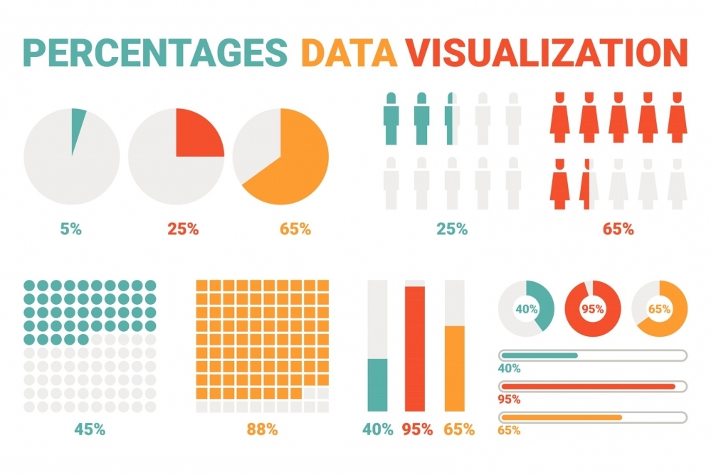
Gain Quick Insights into your Ecommerce Business with Data Visualization
Data visualization is a graphical representation of your data that enables its users to gain insights into the patterns and trends of their sales. By using the right charts, graphs, maps and infographics, users can make faster and better decisions and gain a competitive advantage.
BENEFITS OF DATA VISUALIZATION
Effective data visualization:
- Tells a story for the audience it is intended for. It guides them through the information and allows them to draw conclusions.
- Gives quick insights into how the company is performing against Key Performance Indicators (KPIs) such as Sales, Inventory Turnover and Gross Margin.
- Makes it easier to spot patterns and trends in data, since eyes are drawn to colors and patterns.
- Uncovers unknown facts, outliers and trends. This may be information you never would have noticed in a spreadsheet report.
- Conveys complex data in an easier to understand and remember format than deciphering rows and rows of spreadsheets.
- Sparks better questions.
REQUIREMENTS OF DATA VISUALIZATION DASHBOARD
A Dashboard is a tool to communicate top-level information and business intelligence. It is a quick snapshot of the business, tracking important metrics that are related to the success of a company. From the Dashboard, the user can drill down into the data if they want more in-depth details. To make data visualization dashboards effective, you must:
- Start with Clean Data. Clean data is the #1 requirement for any type of meaningful data analysis. The data must be free from errors; accurate and complete.
- Know your Audience. The CEO is interested in different metrics than someone who works in the marketing department or someone who is responsible for Inventory Control.
- Provide information in a manner that the user can interpret very quickly, usually in 5 seconds or less.
- Organize in a logical layout. The most significant information should be at the top and become more granular as you move towards the bottom of the Dashboard. It should guide the user through a story.
- Limit the number of visualizations to 5-9. If the user wants more detailed information, they can drill down.
BASIC EXAMPLES OF DATA VISUALIZATION FOR ECOMMERCE BUSINESSES
Simple bar graphs
Bar graphs are most effective for communicating the differences between two groups of data or changes over a period of time.
In this example, the first bar graph shows the change in Sales Revenue from one year to the next. The second bar graph shows the change in Margin from one year to the next.

Line graphs
Line graphs are most effectively used to compare two or more different sets of information over the same period of time.
In this example, shipments are compared to the forecast Year to Date.

Combination Graph
Two different types of graphs can be combined to show the information in a different way.
In this example, revenue for each of the company’s brands are shown in the Bar graph, while marketing spend for each brand is shown by the line graph.

Heat Maps
Heat maps can be very beneficial to an e-commerce business. By using different colors, users can quickly see how different groups compare to each other. Some examples of how heat maps could be used are 1) to determine the effectiveness of web pages compared to each other, 2) where in the country profits are being generated, 3) where should
marketing efforts be concentrated.
In this example, using your customer data, you can determine how one state’s sales compare to another state’s sales. This would be a good way to allocate your marketing efforts.

CONCLUSION
These are just a few of the ways that data visualization can help an e-commerce business interpret their data quickly and easily, giving them insight into their business so they can make the best decisions.
For more information about data visualization and how it can help your business, contact the experts at SAFIO Solutions.


